Genovia Art Museum
responsive website
10 Minute Read
Role
Product Designer (Independent Project)
Timeline
Apr - May 2024
Outcomes
Responsive Website Information Architecture Branding
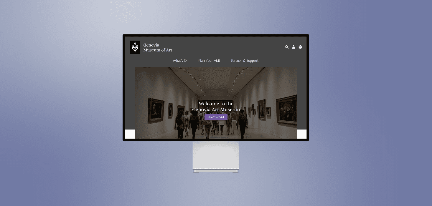
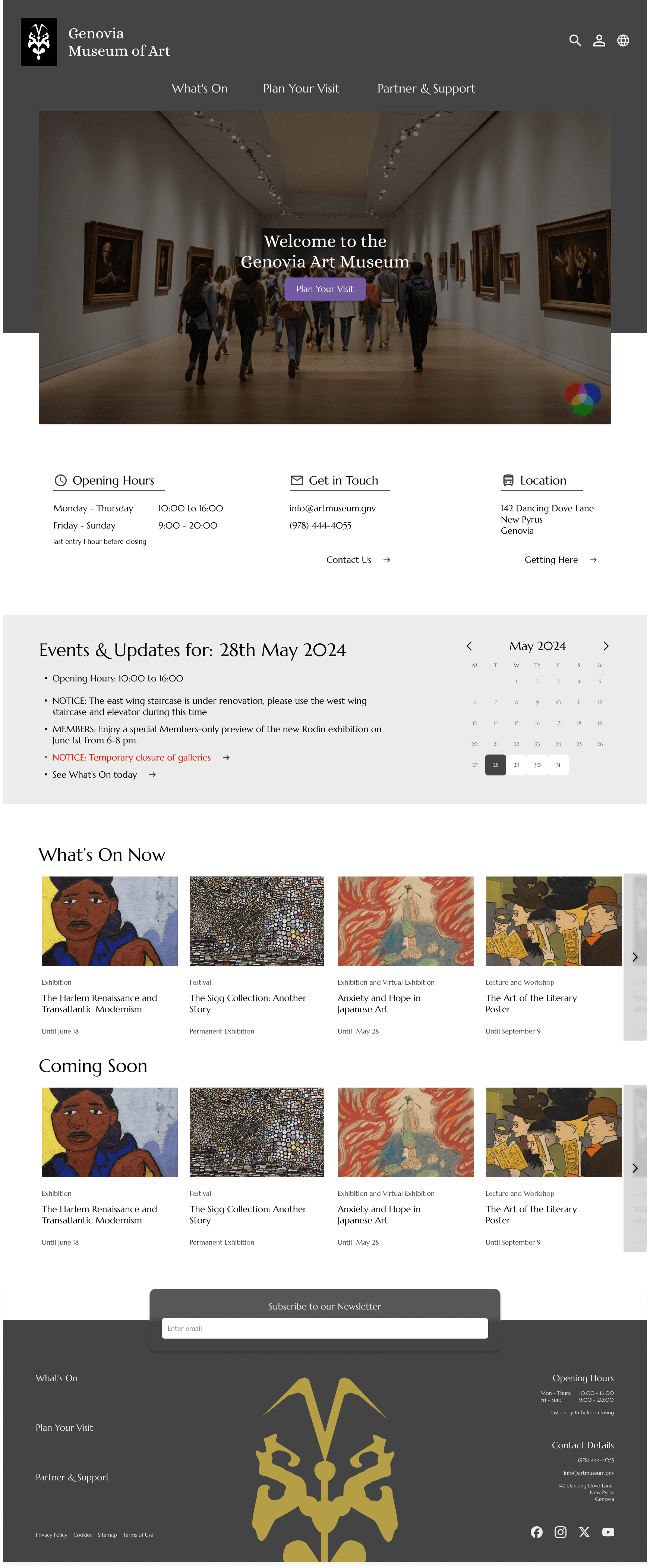
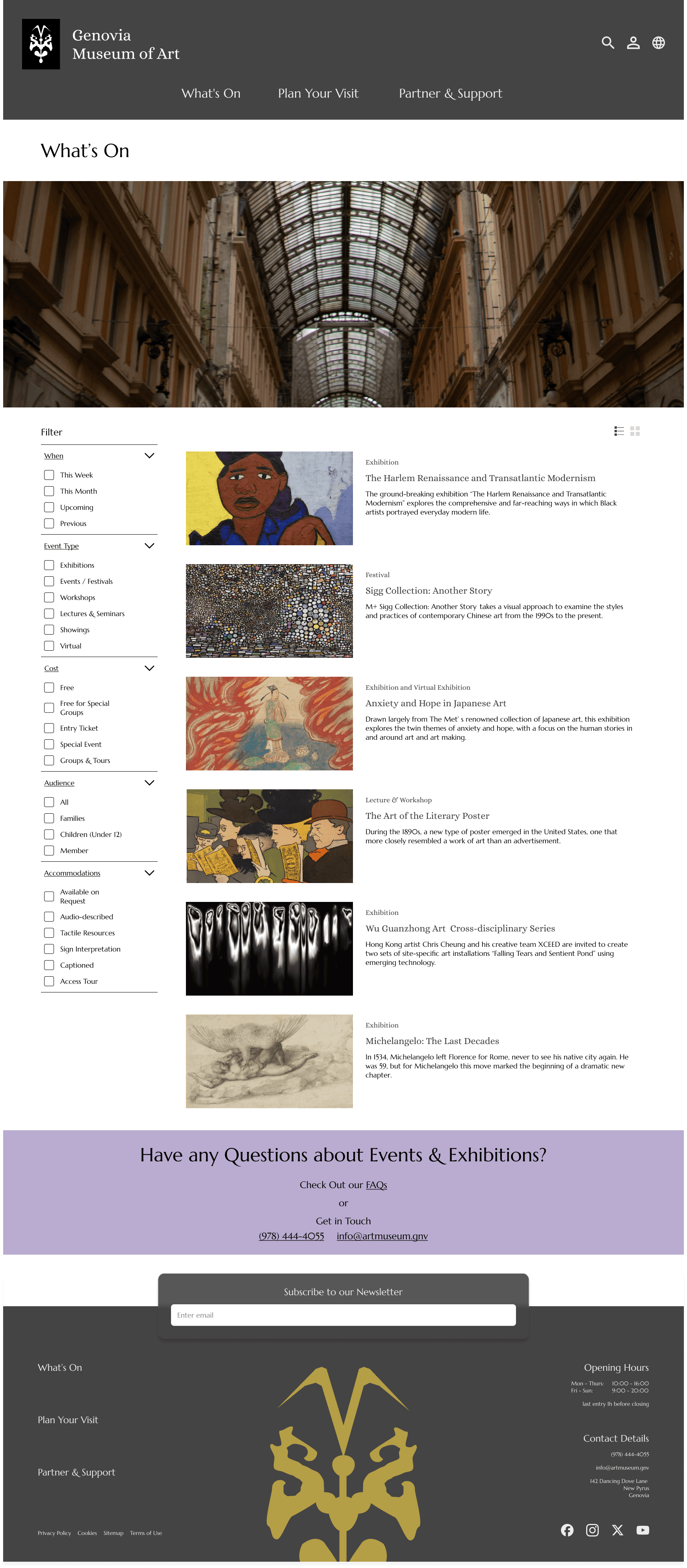
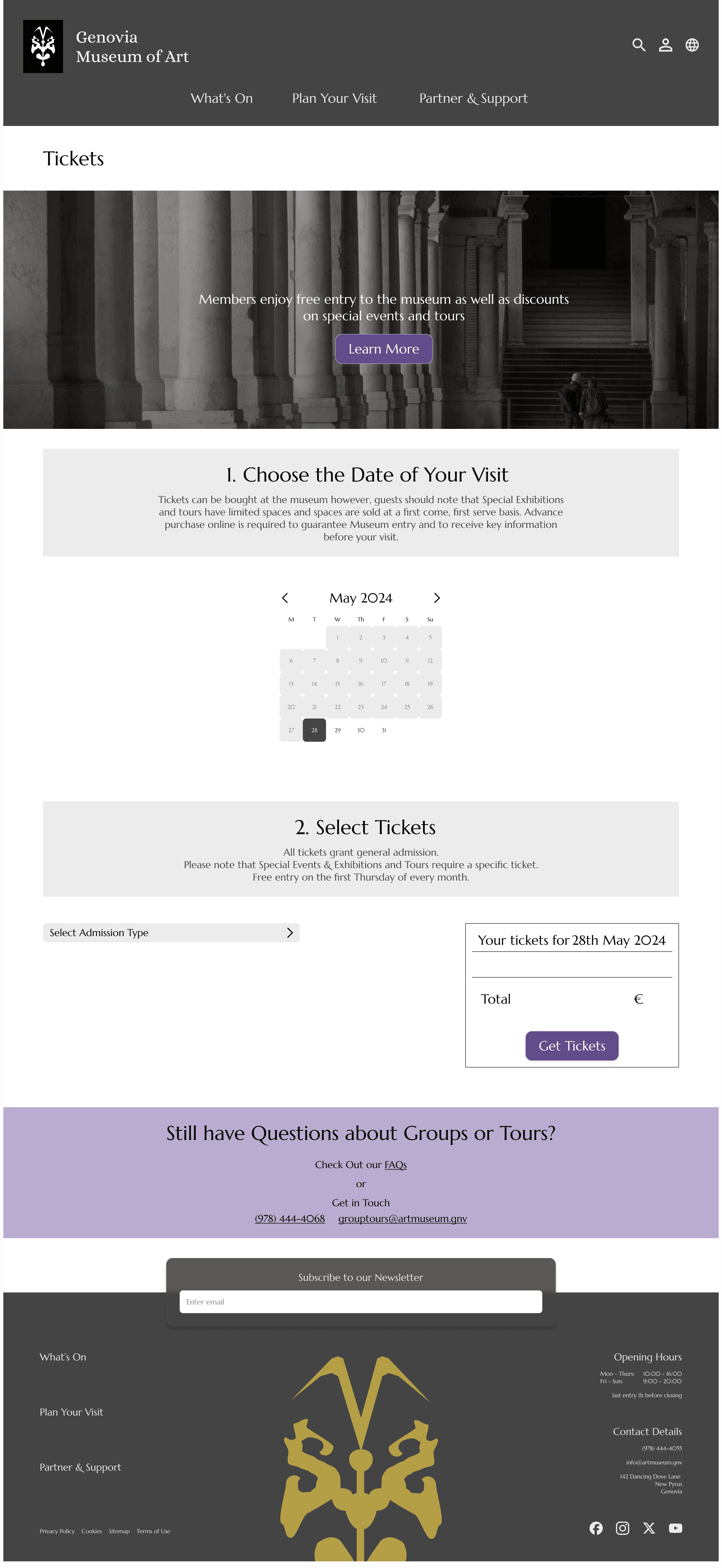
A responsive website for the Genovia Art Museum. This project's aim was to 1. Give detailed and updated information in a variety of areas and 2. Outline clear and secure processes for ticket purchase and donations. Completed as part of the Google UX Design course and inspired by The Princess Diaries (2001), the goal of the museum is for it to be a space for celebrating the history of Genovian art as well as a place for the people of Genovia to share and enjoy their work.
Genovia Art Museum
responsive website
10 Minute Read
Role
Product Designer (Independent Project)
Timeline
Apr - May 2024
Outcomes
Responsive Website Information Architecture Branding
A responsive website for the Genovia Art Museum. The second project completed as part of the Google UX Design course. This project's aimed to: 1. Give detailed and updated information in a variety of areas and 2. Outline clear and secure processes such as for ticket purchase and donations. Inspired by The Princess Diaries (2001), the museum aims to celebrate Genovian art and offer a place for the people of Genovia to share and enjoy their work.
Genovia Art Museum
responsive website
10 Minute Read
Role
Product Designer (Independent Project)
Timeline
Apr - May 2024
Outcomes
Responsive Website Information Architecture Branding
A responsive website for the Genovia Art Museum. This project's aim was to 1. Give detailed and updated information in a variety of areas and 2. Outline clear and secure processes for ticket purchase and donations. Completed as part of the Google UX Design course and inspired by The Princess Diaries (2001), the goal of the museum is for it to be a space for celebrating the history of Genovian art as well as a place for the people of Genovia to share and enjoy their work.
Genovia Art Museum
responsive website
10 Minute Read
Role
Product Designer (Independent Project)
Timeline
Apr - May 2024
Outcomes
Responsive Website Information Architecture Branding
A responsive website for the Genovia Art Museum. This project's aim was to 1. Give detailed and updated information in a variety of areas and 2. Outline clear and secure processes for ticket purchase and donations. Completed as part of the Google UX Design course and inspired by The Princess Diaries (2001), the goal of the museum is for it to be a space for celebrating the history of Genovian art as well as a place for the people of Genovia to share and enjoy their work.
Home
What's On
Plan Your Visit - Ticketing
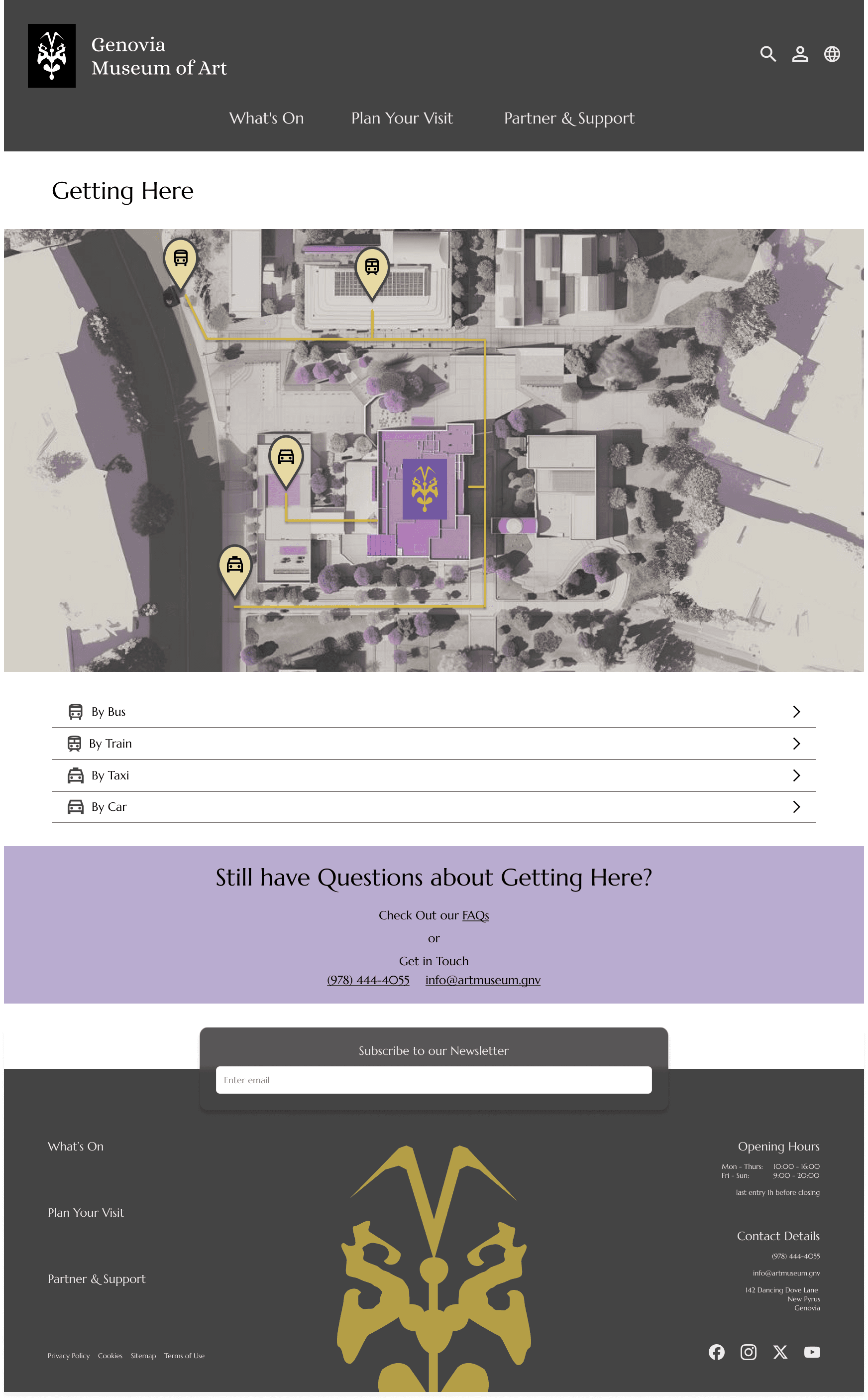
Plan Your Visit - Getting Here
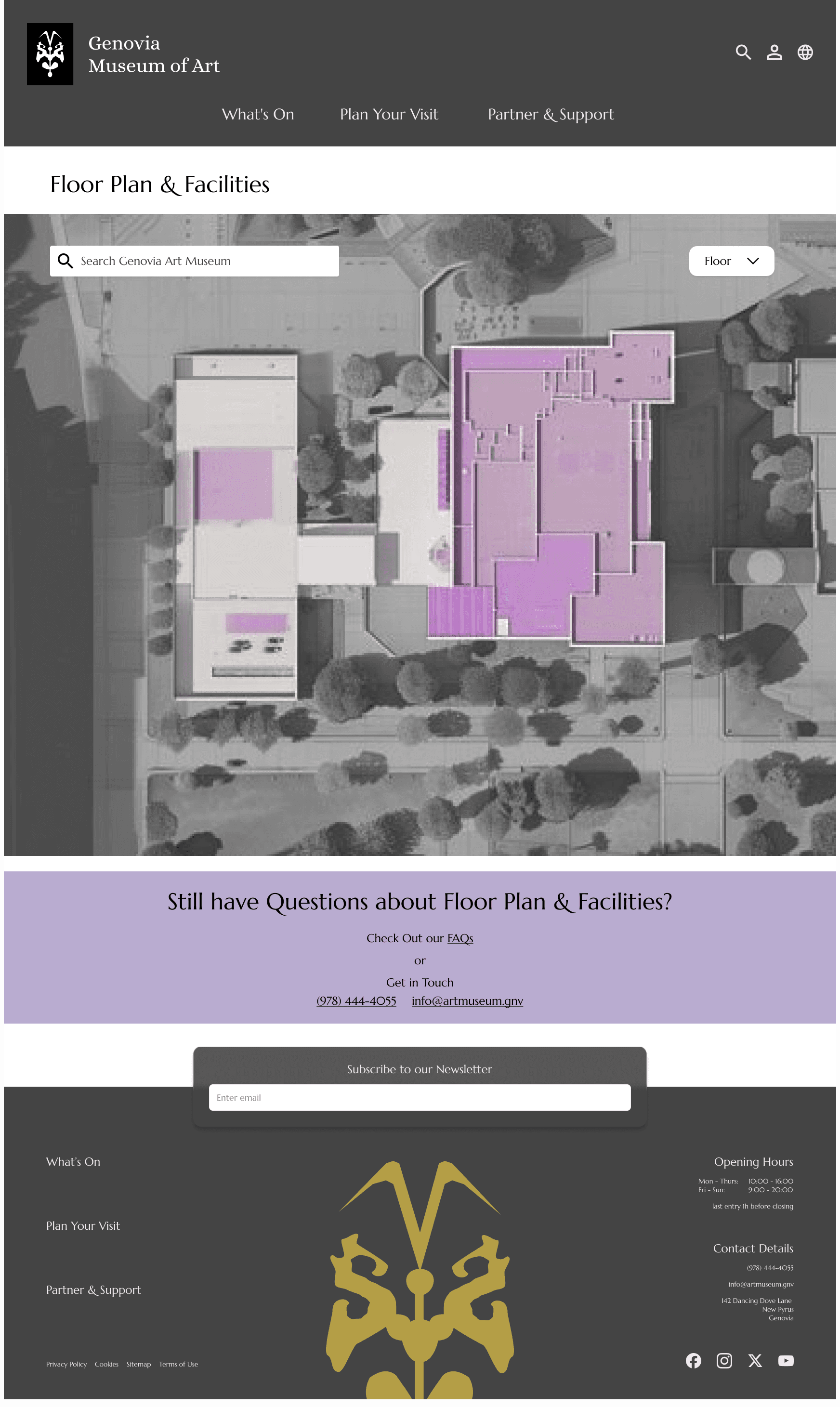
Plan Your Visit - Floor Plan & Facilities
Plan Your Visit - Accessibility

Plan Your Visit - FAQs

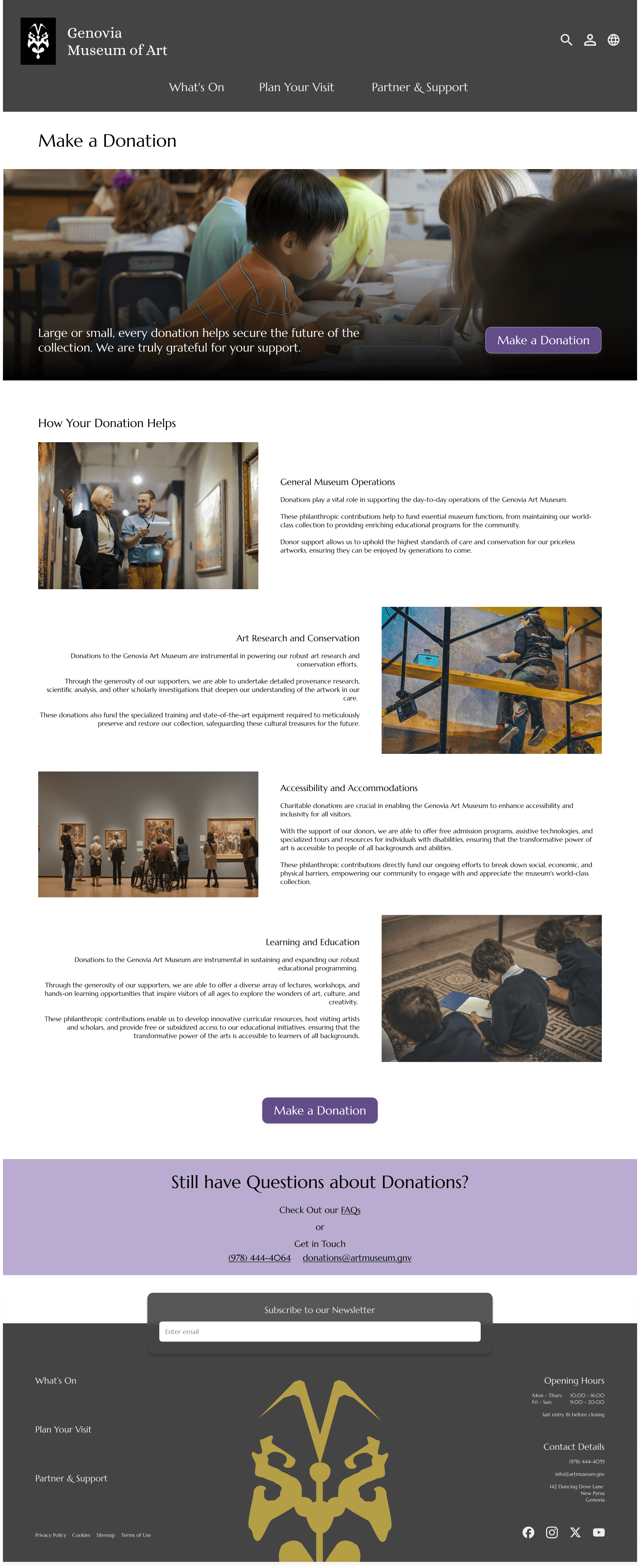
Partner & Support - Donation
Partner & Support - Donation Form

Partner & Support - Membership

Partner & Support - Host with Us

Partner & Support - Careers

Partnter & Support - Contact Us

Home
What's On
Plan Your Visit - Ticketing
Plan Your Visit - Getting Here
Plan Your Visit - Floor Plan & Facilities
Plan Your Visit - Accessibility
Plan Your Visit - FAQs
Partner & Support - Donation
Partner & Support - Donation Form
Partner & Support - Membership
Partner & Support - Host with Us
Partner & Support - Careers
Partnter & Support - Contact Us
Case Study Contents
Understanding
Designing
Refining
Reflecting
Users
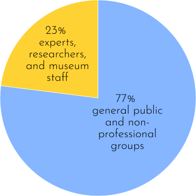
A study of the National Museum of Liverpool's museum website highlighted the importance of understanding museum website users and their motivations in the effective design of their online experiences. They found that museum website users were:
and categorised them into groups based on their motivations

Explorers
personal curiosity

Experience Seekers
see and experience a place

Rechargers
contemplative or restorative experiences

Facilitators
helping others find what they need

Professionals / Hobbyists
specific knowledge-related goals
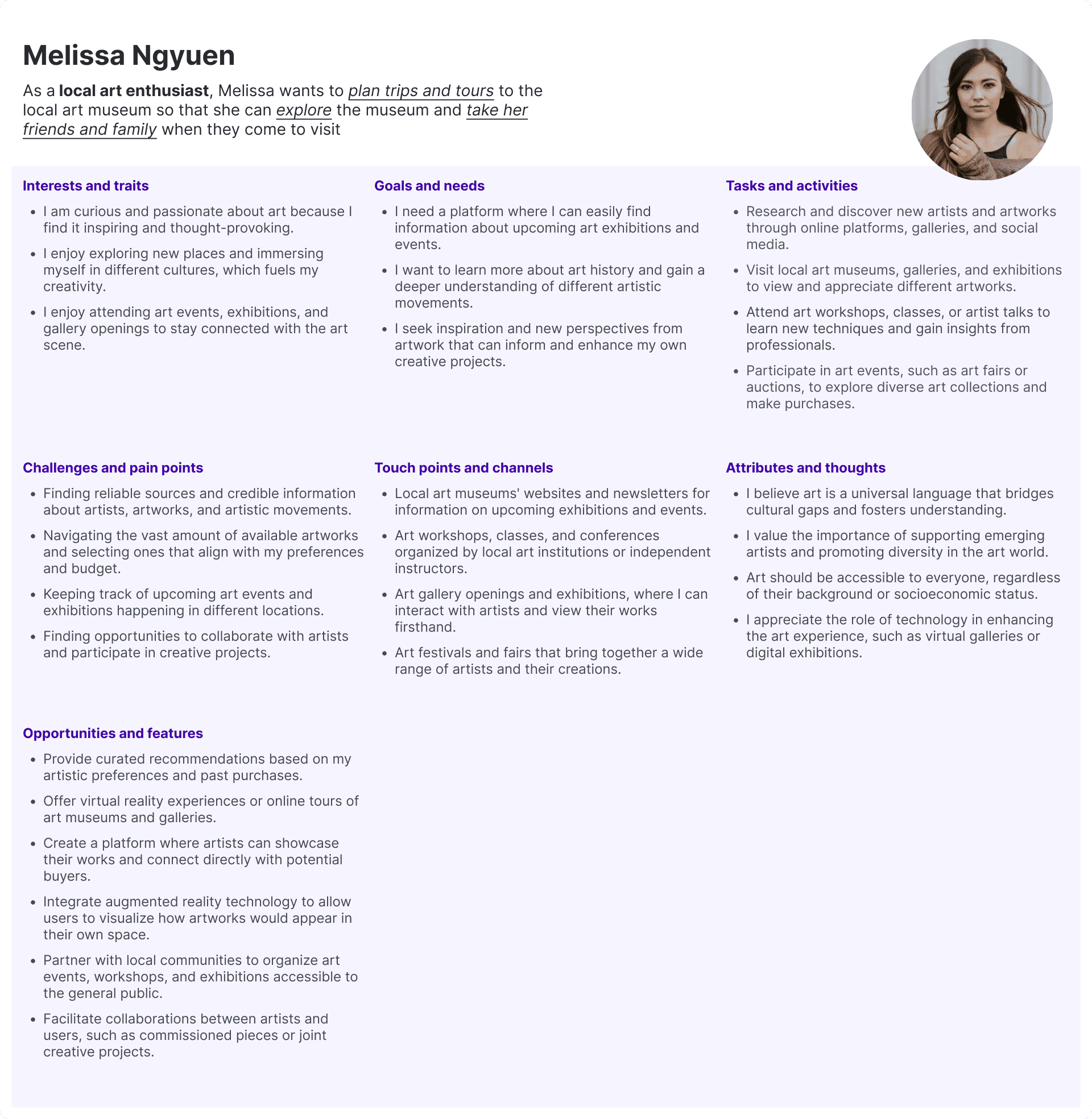
Therefore, I based my user personas to include people in these groups. However, as this space is also for Genovian artists to share their work, I included Katie, a local artist:

Melissa Ngyuen

Julien Rodriguez

David Reynolds

Katie Mtonga
Opportunities
Following these users’ journey maps, I explored their potential activities, goals, needs, and challenges regarding navigating the museum.
I then grouped those challenges together (red) along with ideas for how I could meet those needs (yellow).
This helped me identify the major components of museum websites and opportunities to meet user needs:

Competitive Audit
I also did a competitive audit of other museum websites, focusing on how they tackled these problems and how they organised their sites.
I took a lot of inspiration from many of these sites as I wanted to keep things familiar for users and used events and exhibitions from these museums in my designs.


Case Study Contents
Understanding
Designing
Refining
Reflecting
Users
A study of the National Museum of Liverpool's museum website highlighted the importance of understanding museum website users and their motivations in the effective design of their online experiences. They found that museum website users were:
and categorised them into groups based on their motivations
Explorers
personal curiosity
Experience Seekers
see and experience a place
Rechargers
contemplative or restorative experiences
Facilitators
helping others find what they need
Professionals / Hobbyists
specific knowledge-related goals
Therefore, I based my user personas to include people in these groups. However, as this space is also for Genovian artists to share their work, I included Katie, a local artist:
Melissa Ngyuen
Julien Rodriguez
David Reynolds
Katie Mtonga
Opportunities
Following these users’ journey maps, I explored their potential activities, goals, needs, and challenges regarding navigating the museum.
I then grouped those challenges together (red) along with ideas for how I could meet those needs (yellow).
This helped me identify the major components of museum websites and opportunities to meet user needs:
Competitive Audit
I also did a competitive audit of other museum websites, focusing on how they tackled these problems and how they organised their sites.
I took a lot of inspiration from many of these sites as I wanted to keep things familiar for users and used events and exhibitions from these museums in my designs.
back to section menu
©2024 Tamara Sher. All Rights Reserved.
Ready to work together?
Let’s do this!
click email to copy
©2024 Tamara Sher. All Rights Reserved.
Ready to work together?
Let’s do this!
click email to copy
©2024 Tamara Sher. All Rights Reserved.
Ready to work together?
Let’s do this!
click email to copy
©2024 Tamara Sher. All Rights Reserved.
Ready to work together?
Let’s do this!
click email to copy